Kitchen Inspiration: Q&A with Tom Raffield
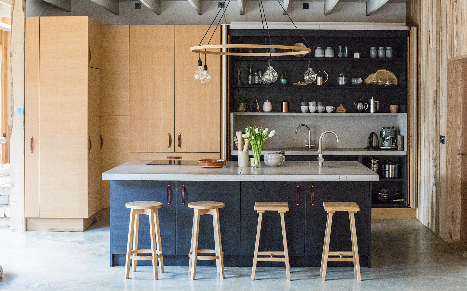
The kitchen is the thriving hub of any home, in which a variety of activities take place on a daily basis. Whether you’re designing your own kitchen from scratch or renovating and giving your space a much needed makeover, it's difficult to get everything right.
We've caught up with our founder and designer, Tom Raffield, to offer an insight into his Grand Designs kitchen and provide some inspiration for those planning their own project.

Q: How did you go about designing your kitchen?
TR: We started by making our own sketches and drawings of the space - we already had a clear vision of the kind of kitchen that we wanted. We worked with Cornish-based Kettle Co whose design team asked us the following questions...
How do you intend to use the space? Who will be using the kitchen most? Do you enjoy cooking? How tall are you? How do the children interact with the kitchen?
These questions made us really consider the space and our end goals meaning that functionality was at the forefront of the kitchen’s design. There was also plenty of room for creativity in the design... with the result being lots of quirky features and innovative uses of materials.
Q: How did you choose which materials to use?
TR: We wanted to make the most sustainable choices that we possible could when building the house. Hence, one of the key elements we focused on were the materials we used. We wanted the kitchen to correspond with and compliment the rest of our steam bent home and at the same time welcome nature inside.
We incorporated naturally sourced materials such as granite for the worktops, leather for the cupboard handles and lots of rough sawn wood from our own woodland.
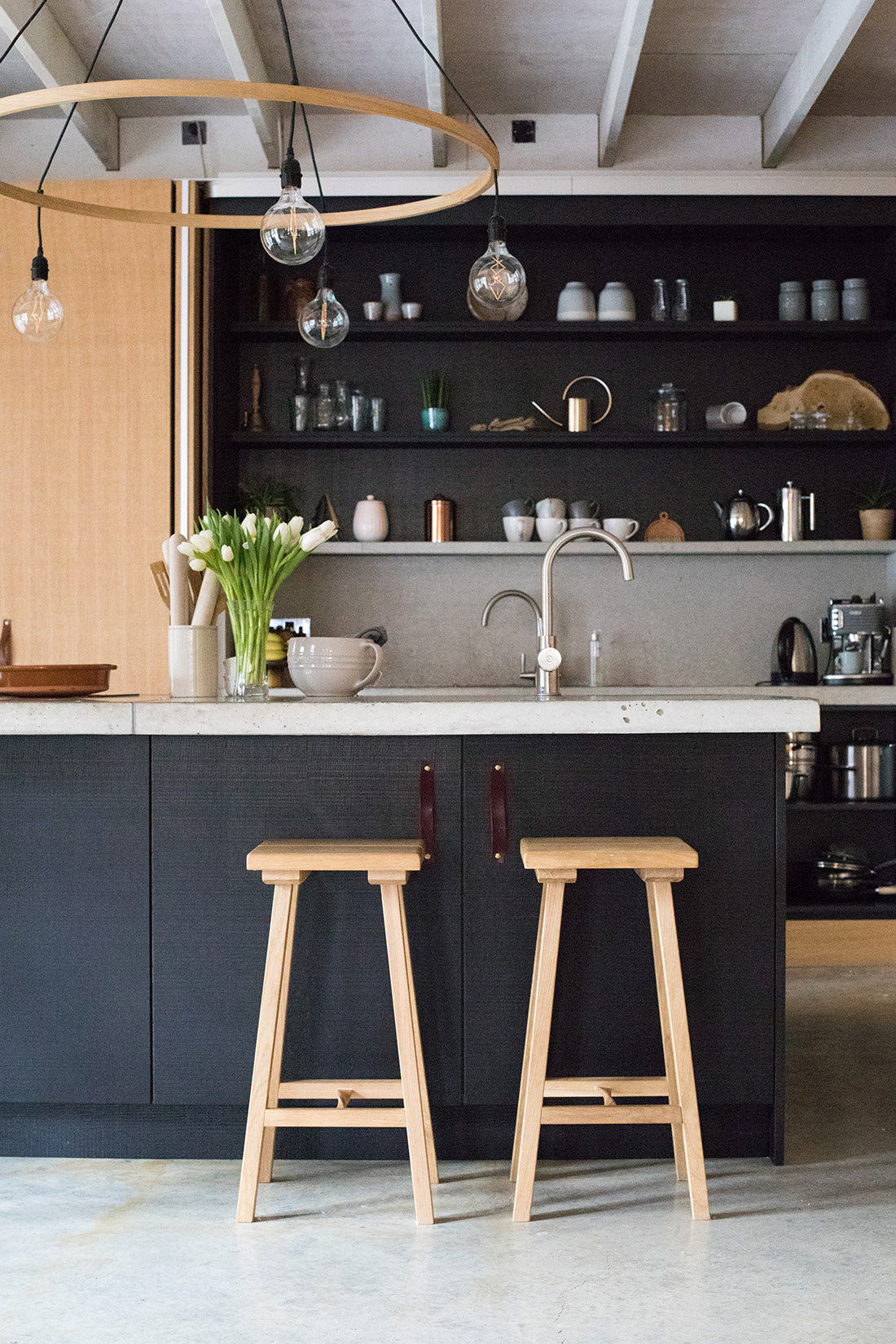
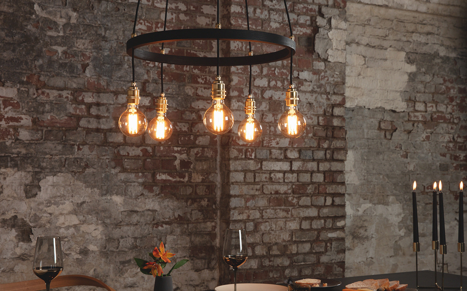
Q: Talk us through the lighting. Why did you decide to use the Kern Pendant in your kitchen?
TR: Our Kern Pendant is perfect for a kitchen as it offers great task lighting which is of course necessary in any practical area. We wanted a statement fixture that would illuminate the kitchen island yet at the same time marry with the aesthetic of our open plan living space.
The five naked filament bulbs that suspend from the wide steam bent circumference of the Kern's wooden oak frame disperse light widely and evenly. The Kern is also dimmable which means it's great for creating relaxed dinner party ambience and late-night mood lighting.
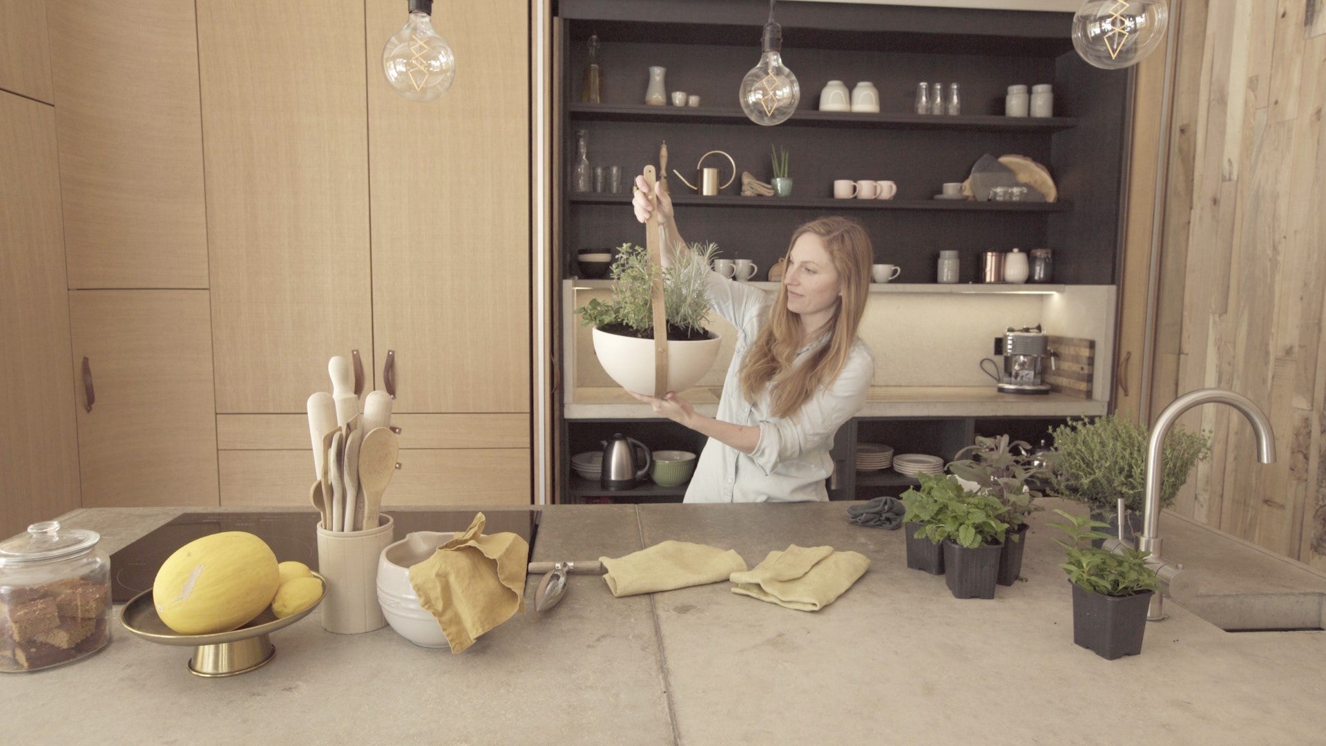
Q: We've also spotted several of your new Green Range Planters in your kitchen - how do you utilise these?
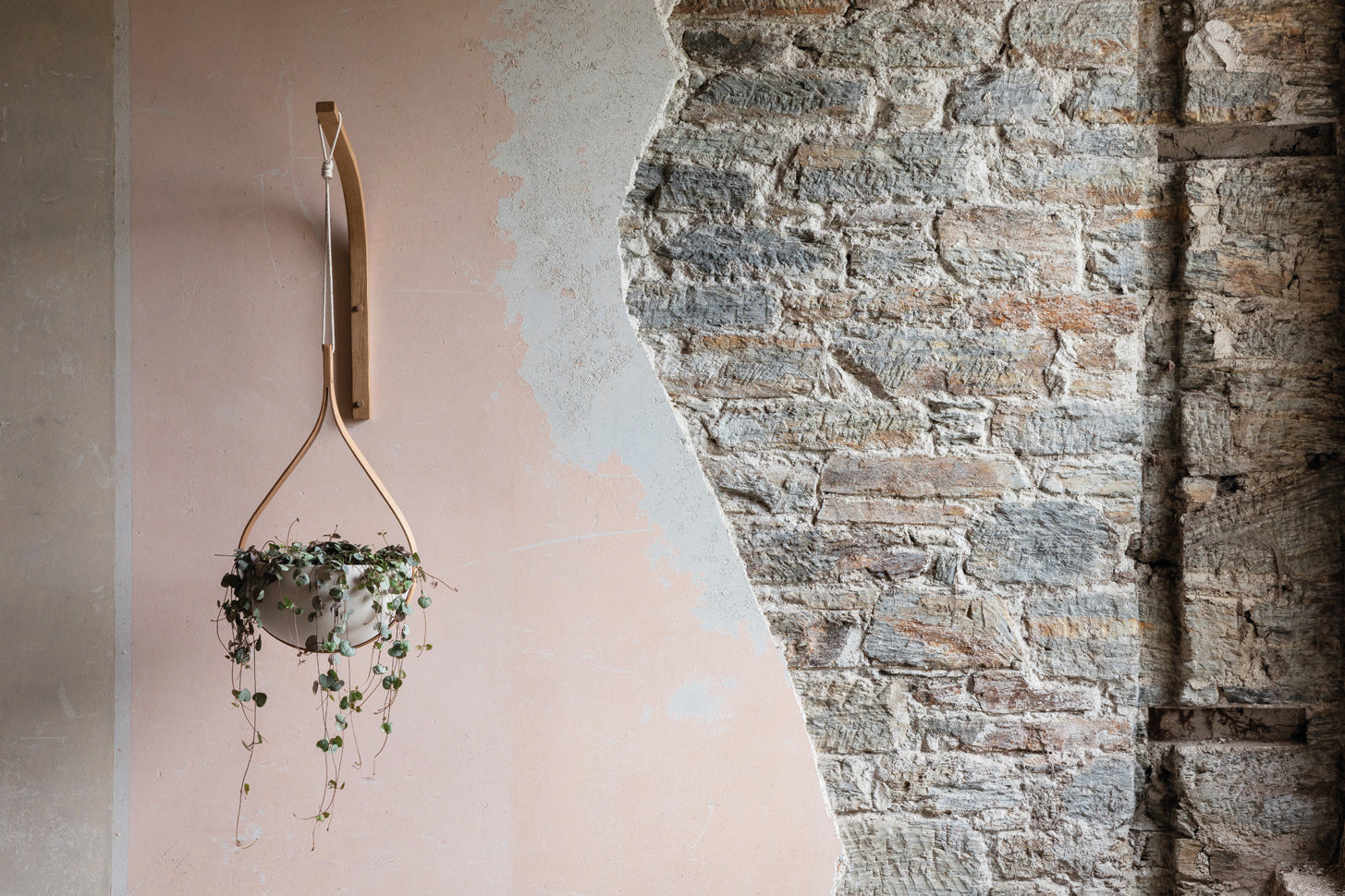
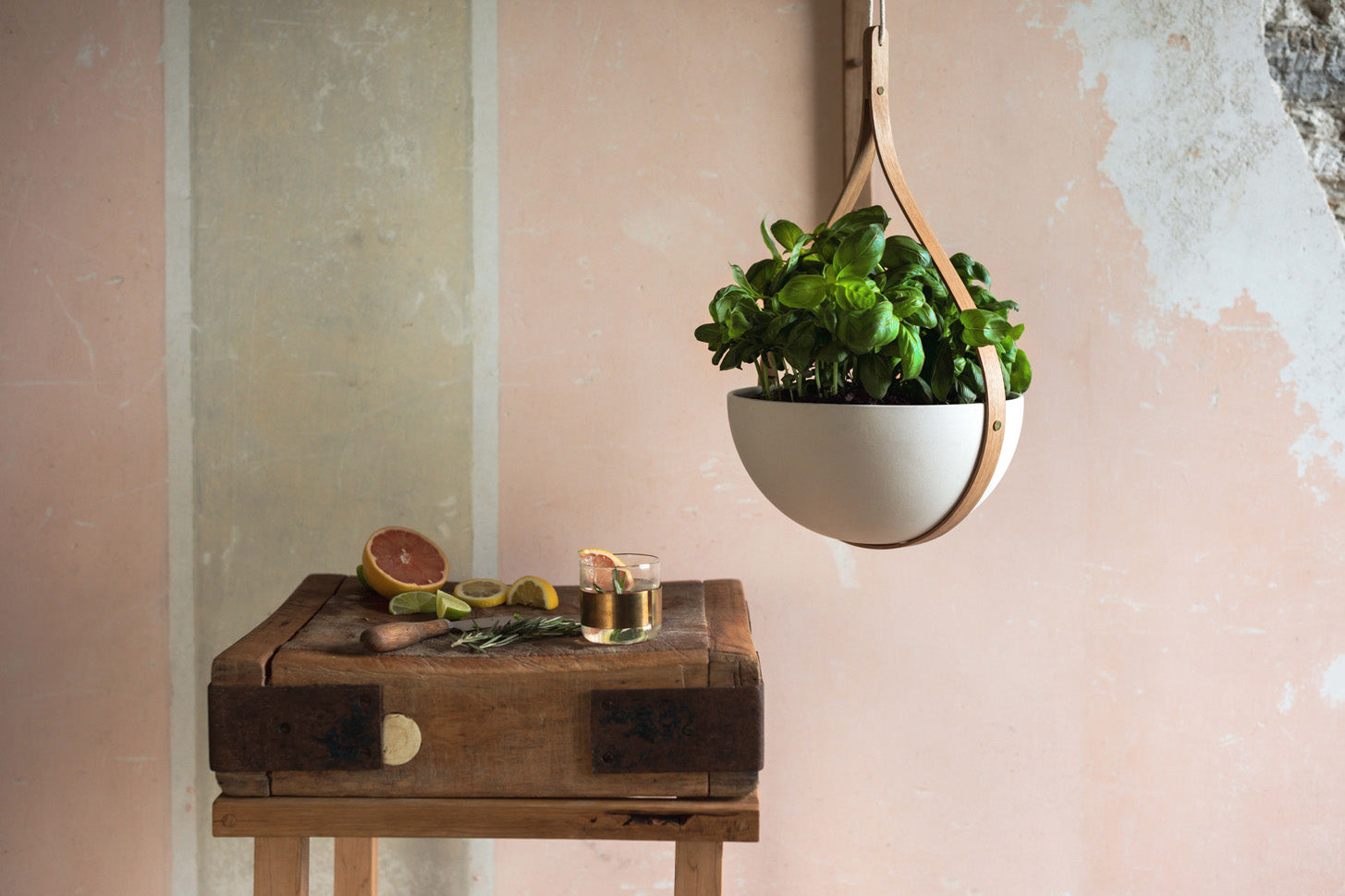
TR: The Morvah Hanging Planters, part of our exclusive Green Range are incredibly versatile and a really valued product in our home. We wanted to keep our kitchen worktops free of clutter, as it's a space that can easily get messy (especially with the children) so the Morvah Wall Planter was a great option for us.
The benefit of having plants in your home is something we are really passionate about and continuing this theme throughout each room in the house was important to us.
Q: Why have you featured a monochrome palette in your kitchen?
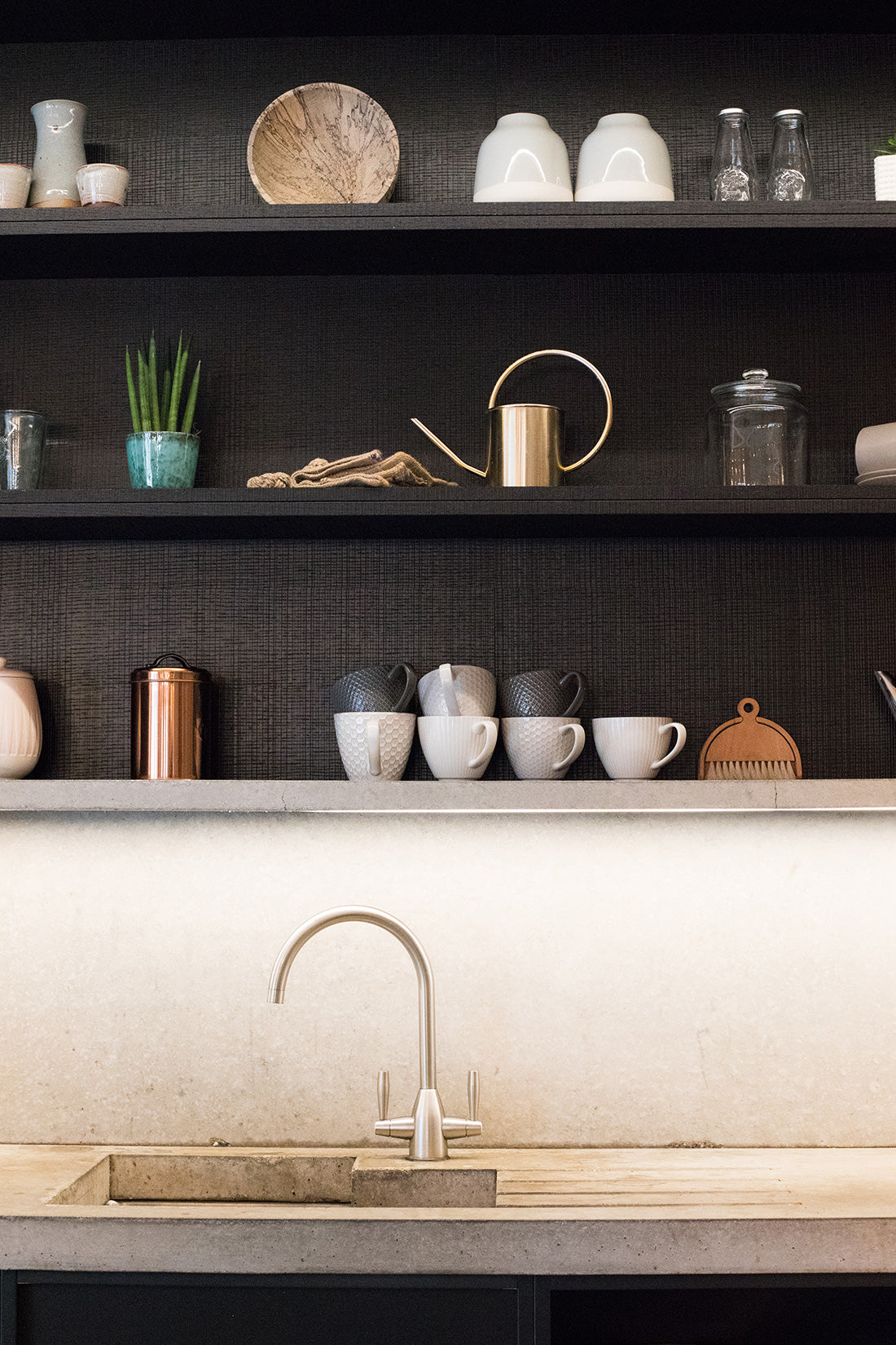
TR: We really like the contrast of dark colours against lighter tones. Monochrome is a great option, as you can easily incorporate different textures, materials and styles into your kitchen when darker colours are the main backdrop.
Our kitchen has a light grey concrete floor, wooden cladding, granite worktops, ebonised wooden shelving, leather handles and metallic accents. I sometimes think that all of these different materials might look out of place if it weren’t for the monochrome palette tying it all together!
Q: Any tips for people who are designing their own kitchen?
TR: Think function - but don’t be afraid to get creative. Function is obviously the most important thing in a kitchen as there are so many tasks that happen there, from cooking, to socialising and even working.
It's a space that needs to be designed with all these functions in mind, but that doesn’t mean it can’t have character and be fun as well. Enjoy the experience!
Photography credits: Huckberry, Kirstin Prisk, Seasalt.
Posted: 06.06.19
Updated: 28.02.23